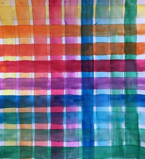
 During this unit we took different colors of watercolor and mixed them together and figure out what they make together. With our watercolor projects we could really do anything we wanted to and I'm pretty sure I did a sunset but I don't have a picture of it. But, I really liked this project because watercolor is very easy to work with and blend which made it turn out really nice.
0 Comments
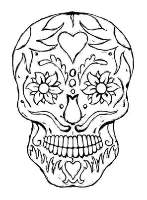
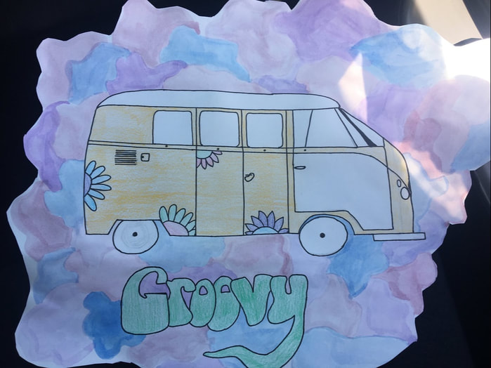 This was by far my favorite piece. I had a lot of fun because I really wanted to draw something like this. I also love how the groovy turned out and the colors I used in the back made it look a lot better.
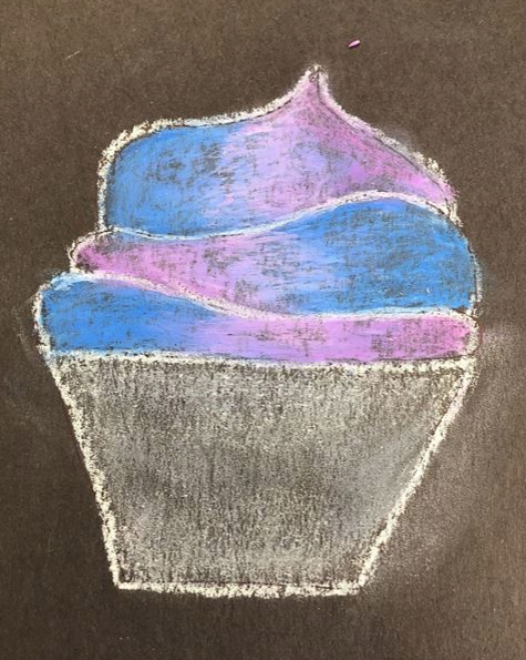 In this unit we learned about the different ways to draw cupcakes, cakes, and slices of cake. We also learned that in order to shade something with lots of color, you have to look on the color wheel and pick the color opposite of it. I liked this unit because it was fun to make funky colored cupcakes, but it was also challenging trying to figure out how to draw frosting and make the slice of cake look 3D and realistic.
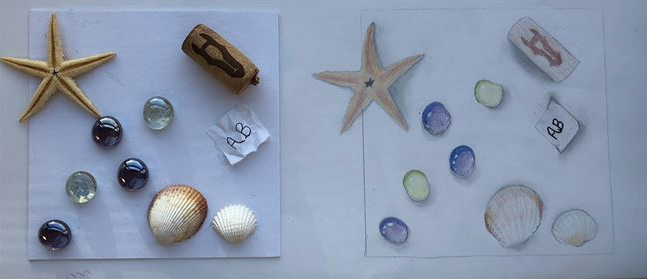 During this unit we gathered items from around the room and glued them down. Then we had to draw the items as realistic as possible and worked a lot on shading. We also worked on how to highlight and make it look like the light is hitting certain objects. I liked this project because it was a challenge to try and get everything as realistic as I could. I had trouble trying to draw and shade the crinkles in the paper but I figured out how to shade and highlight.
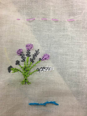
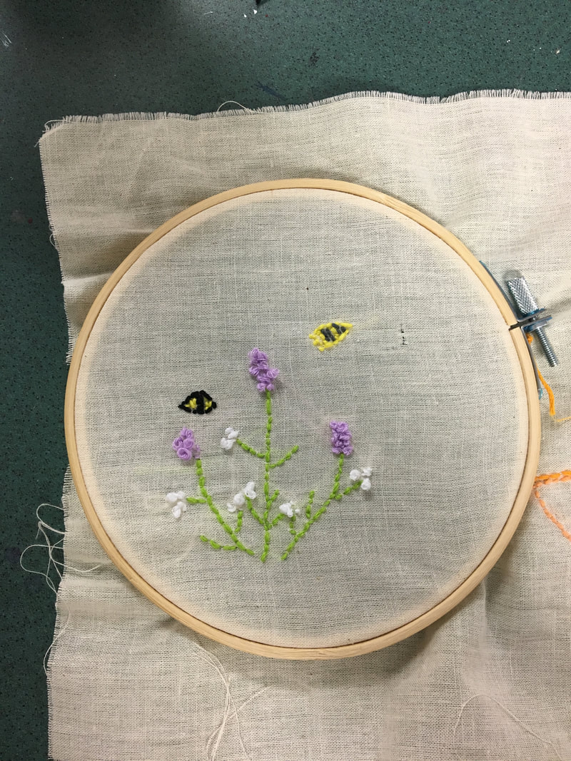
We started embroidery by watching a video of Faith Ringgold and how she would write stories about her childhood through quilts. So we made an embroidery sampler and had to do 8 samples of stitches and and make a mini project. Then we used our own hoop, and needle to start our own project. For my project I decided to go floral and do something simple and cute. Luckily, if we had trouble threading the needle we would use an embroidery floss and use that to thread our needles. I liked embroidery because it was fun to learn new stitches and make a cool project.
We started carving with an EZ carve. We started learning how to use the carving tools on that so we were able to do it on the linoleum. Carving on the linoleum is a lot different than the EZ carve, it hardens much faster and its harder to get through. In order to print well you need to carve deep on the places you don’t want to show up. The ink dries fast and you need to work fast in order for it to print fully. The brayers only work really well if you do it fat and cover it completely in ink. It was a lot of work, but it was fun to learn how to carve. The ink is something you need to work quick with since it dries extremely quick.The printing block is also something that you need to be able to do quickly and precisely. However, being able to use a brayer and using many layers of ink can make it easier to print.
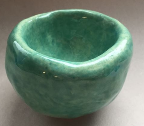 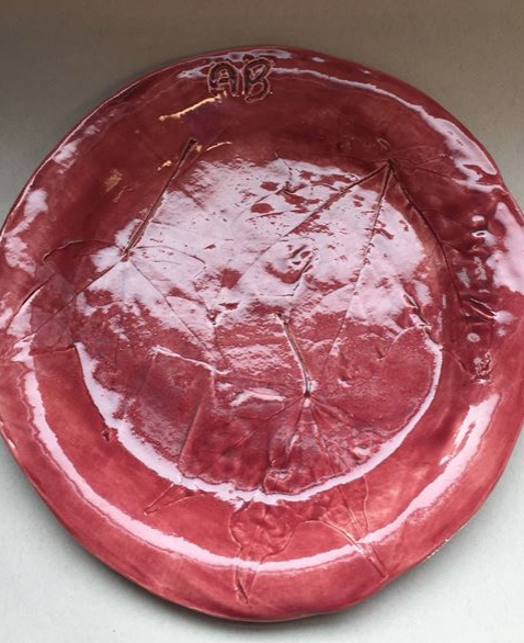 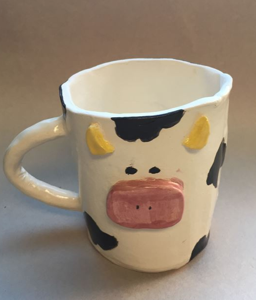 During the pottery unit we did a lot of projects. We started off easy with a pinch-pot, and a plate. With the plate we got leaves from outside and put them in the wet clay to leave a print. Once we put them in the kiln the leaves burn away and leave the imprint of the leaf. After we did those we started on our mug. For my mug, I decided to do a cow. The mug was one of the harder projects to see what we could do with clay. I liked this project because it was fun to make something and watch it actually turn into what my idea was and have it come out how I wanted to. I liked this project a lot because it was fun to make all 3.
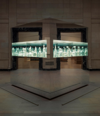 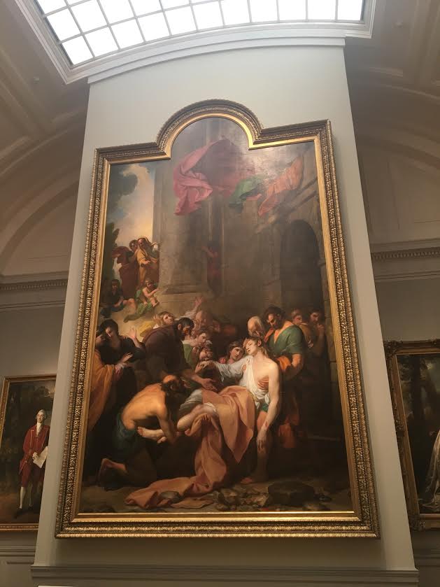 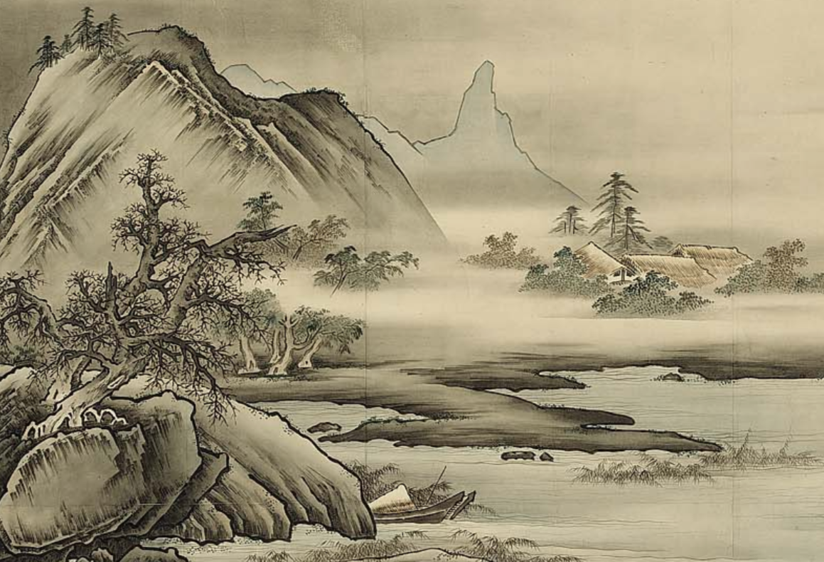 I hear the wind blowing through the trees. I smell the mustiness of the fog and air around me. I need a jacket to keep warm. I am going to the mountains to paint. I feel relaxed. I want to make it home before dark. Dear Bridget, I am writing to you from Japan, the Meiji Era. It is stunning here despite the fog covering the tops of the mountains. It is very relaxing and there arent too many people here, I think you would like it a lot. Next time you have to come! Sincerely, Abby At the Museum of Fine Arts we saw different types of art that ranged from modern to ancient and landscapes to portfolios. These were 2 of my favorites that were very different. The first one was a bunch of what looked to be glass bottles in a box made out of mirrors. When you looked inside it looked like they go on forever. The painting beneath it took up the whole wall that it was on. I really liked how it was the center of attention and it was very hard to miss. 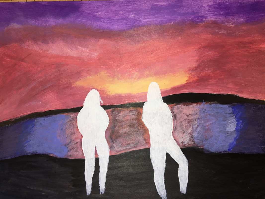 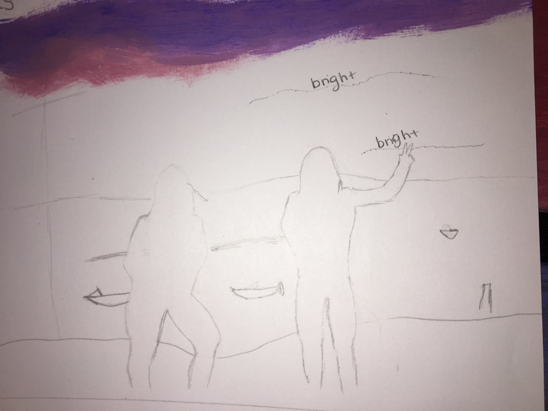 This is my landscape painting. The picture I based this off of was taken in Hog Island in July. I chose to do it in acrylic because I need bright colors and water color wouldn't be able to bring out the bright pinkish yellow in the sunset. The most challenging thing for me, was bringing the dark colors into the light colors. It was difficult to make them look natural. I decided to do the silhouettes in white to emphasize the people against all of the colors.
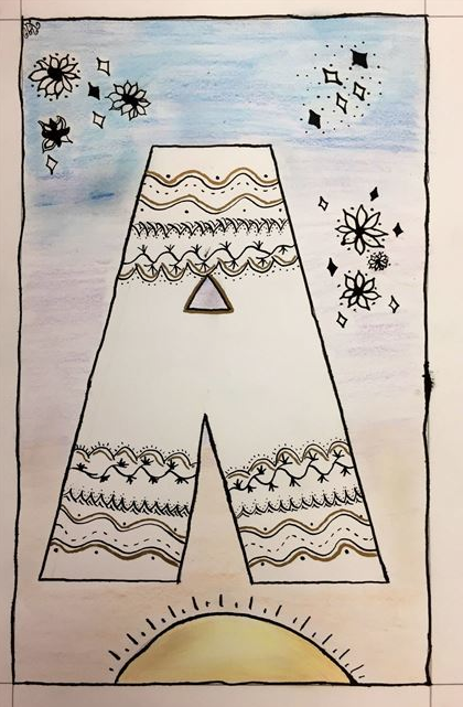 This is my illuminated letter. I made my letter simple and blocky, since we had only been doing calligraphy for a day, this was the only thing I knew would come out nicely. After this I just started drawing designs and things that would look good around it. I also added a sun because I like sunny days, and sunsets. That's where I came up with the background colors. I used blue, purple and a pinkish orange to make a sunset effect in the background. Inside the A I decided to continue with the designs. I went around the A and did the same designs in all the corners and continued that. Then, I added in some gold to give the A more of a pop.
|
Abby BArrettArchives
March 2018
Categories |
 RSS Feed
